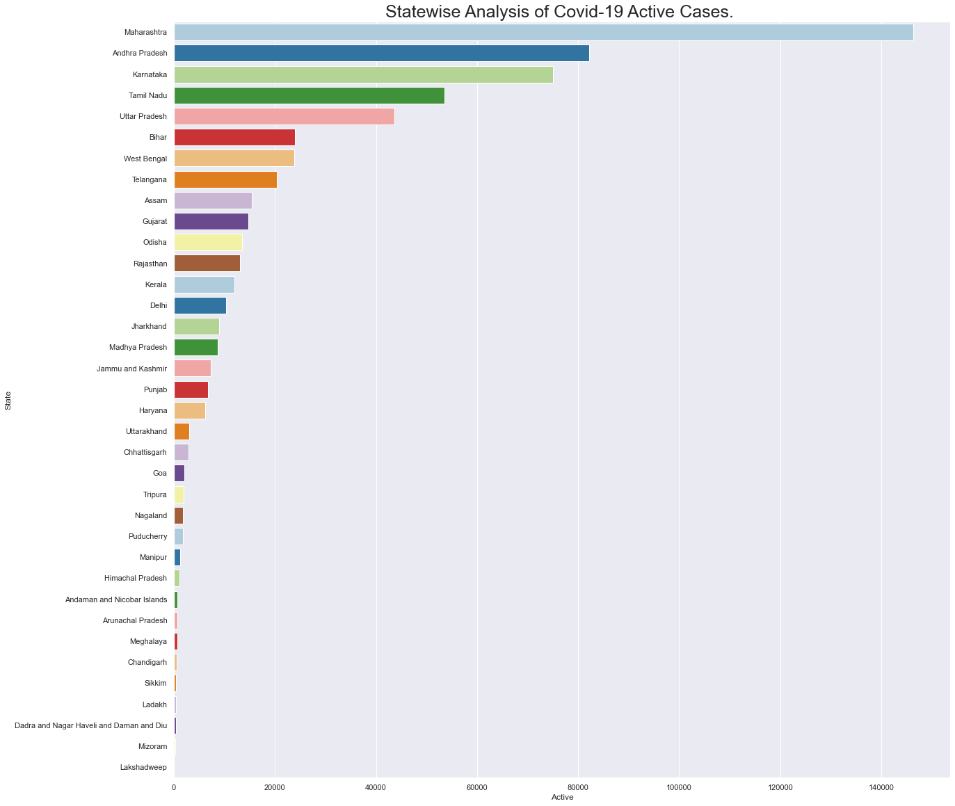
The project represents vulnerability of all states of India in Covid-19 by analyzing situation and representing it through various visualization techniques.
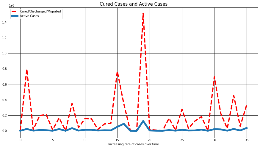
First graph shows rate of recovered cases vs active cases.
Here an overall analysis is done based on active cases and recovered cases in allover India then a comparision of both the rates is plotted using a line graph.

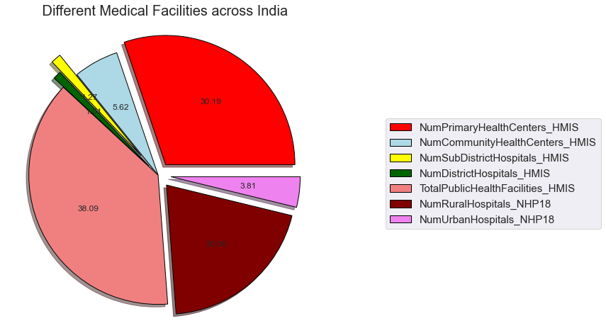
This graphs represents distribution of various types medical facilities in India.
In this plot different sections with different kinds of health centers are observed and their respective percentages are displayed using a pie chart.
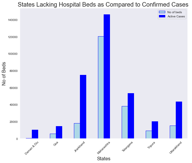
Graph that shows all the states that lack total number of beds.
In this figure an analysis of above graph is done then those states are extracted where number of active cases exceeds total number of beds.
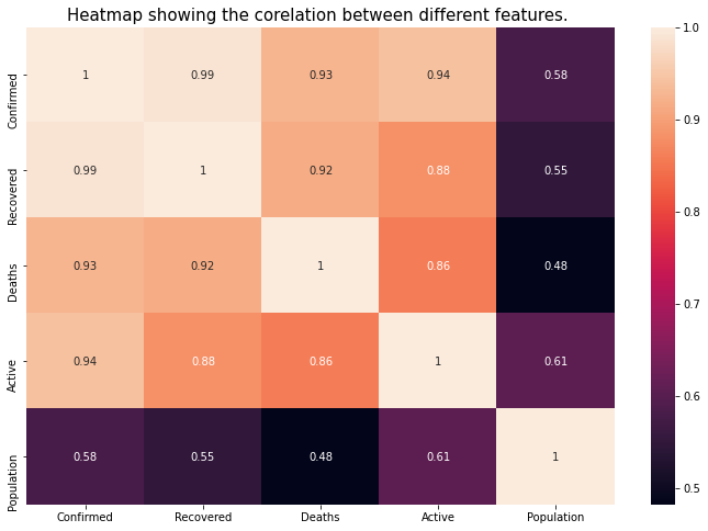
A heat map showing relation between different features of Covid-19.
This heat map shows a correlation between different features of covid-19 and magnitude of the phenomenon as color, where the variation in color specifies intensity of phenomenon.
Prioritization of states in order to distribute vaccines.
After analyzing all the vulnerabilities above in India states an observation can be made that which states are of prime concern. As their is eager need of vaccine based on these observations we can define an order for the states to be provided with the vaccines.
